Tuesday, September 13, 2011

Doing some dyeing!

My kitchen has been turned into an art studio this week: my daughter has claimed the breakfast table for her paintings, and I have taken over the counter, sink, and work table for fabric dyeing.

I cleaned everything up this afternoon, just in time to take a few photos before it got dark, so I can link up to Texture Tuesday over at Kim Klassen's cafe.  The theme this week is "Do...."  Well, I've been doing lots this week... but not photography! Click here to check out the gorgeous images submitted by thoughtful artists who take their craft seriously -- my photos were taken almost as an afterthought; still, I think you can see I am in a colorful mood!

Kim Klassen's "Scripted Autumn" (overlay @100%), my "medium copper" (lighter color  @70%),

"Scripted Autumn" (soft light @100%), my "medium copper," (inverted, soft light @100%)

"Scripted Autumn" (overlay @100%), my "light copper" (inverted, soft light @50%)
Sometimes I just want to make colors, and that's why I love to dye -- I really enjoy the mad scientist aspect of mixing the dyes and playing with chemicals.  But most of all, I am thrilled by the mystery of how it will all turn out.  I like to do low-immersion dyeing; the patterning of the colors on the fabric (and even the colors themselves) comes out differently every time since I don't follow exact recipes.

(I generally leave the fabrics in the dye anywhere from 4 to 24 hours.  I am not overly fussy about the batching time.)

This time I also dyed yarns, threads, cheesecloth, throwsters waste, and silk carrier rods.  They all took the dye beautifully!


I like to use the spent dye to stain tissue paper or paper towels for use in collage.  The dye that has already been used to dye fibers still has enough umph to color the papers and since I hate to let anything go to waste, I embarked on a major paper staining sub-project.  You can see in this photo how you quickly run through stacks and stacks of tissue paper; for some reason I ended up with miles of green paper.....

One thing leads to another, and since I had all the equipment out, I wanted to try batiking using dyes instead of paint.  (I had previously taken a workshop on soy wax batik with Melanie Testa using fabric paint.)  The soy wax stood up pretty well to all the rinsing you have to do to get rid of excess dye.  The beauty of soy is that it is safe for household plumbing -- a good thing since much of it washed out in warm water.  The photo doesn't do justice to these pieces.... they turned out very well:


As if all this wasn't enough, I've been reading Jane Davies' new book, and thought I'd try out the tyvek technique she mentions in it.  You basically just iron some tyvek between sheets of newspaper (you can use an express mail envelope from the post office).  After a few passes with the iron, it will begin to shrivel and distort.  Being careful not to melt it too much, you can get some interesting weathered effects.  Here, I've taken shriveled tyvek pieces and painted them with metallic paints.


British artists such as Maggie Grey and Jean Littlejohn and Jan Beaney use these in their free-form embroideries, but I think they would also work well in collage. Here, I've used a piece as a decoration for a box I made:
Sometimes I think that I enjoy making the elements of art -- the decorated papers, the painted and decorated surfaces, the dyed fabrics -- even more than the finished artwork.  I love color and texture for its own sake.  What's your favorite part of the process?

Tuesday, September 6, 2011

Candy coated popcorn, peanuts and a prize...

You know, sometimes you just look at a texture and you know immediately that it's going to work for you.  Kim Klassen's texture for this week is called "Cracker Jack," and I am in love.  It's just the right thing to use to give your image a vintage feel.

My garden is looking dreary and bedraggled from the big storm last week, so I dipped into the archives to play with my new favorite texture.  Click here to visit Kim over at the Cafe, and check out all the wonderful eye candy there.

First I tried it on some daisies:
Kim Klassen's "Cracker Jack" (color burn @100%), "Mayzee" (soft light @51%) plus one layer of  a texture of my own (made from macro photos of the copper pans I showed for the Orange e-dition of TT!) 


"Cracker Jack" (overlay @70%) and "Cracker Jack" (color burn @75%) plus one inverted layer of my copper texture

I didn't record my texture recipe... sorry!  I think I used Kim's "Aurora" and not "Cracker Jack," in any case....

 It added a nice rough texture to this grasshopper -- doesn't he look like an alien?
I added a gradient map adjustment layer (blue-purple-green), then "Cracker Jack" (linear burn @100%), and another layer of "Cracker Jack" (inverted, then put  on screen mode @51%)

I used it on some Italian architecture, and here's where I started to really see some possibilities:
"Cracker Jack" (soft light @25%), "Cracker Jack" (overlay @39%),  "Warm Grunge" (soft light @75%), "Warm Grunge" (screen @20%), and one layer of my copper texture

"Cracker Jack" (overlay @57%), "Mayzee" (multiply @22%), "Warm Grunge" (overlay @49%), and one layer of my copper texture

"Cracker Jack" (soft light @10%), "Warm Grunge" (overlay @100%), "Mayzee" (color burn @25%), and one layer of my copper texture

"Cracker Jack" (overlay @48%), "Warm Grunge" (color burn @61%), "Mayzee" (overlay @40%), and one layer of my copper texture
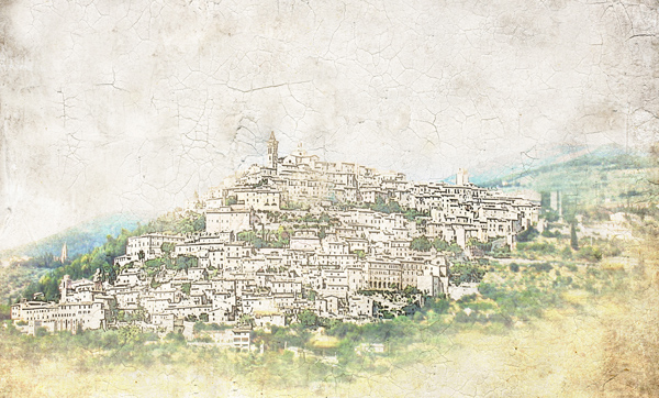
But this last one is my favorite of all -- it made this hill town look like an old map:
First, I cut the town from the background and applied the poster edges filter.  Next I added "Cracker Jack" (overlay @100%) and "Mayzee" (normal blending mode @66%, texture brushed off the buildings.)
When I wrote the title for this post, I was thinking of the old Cracker Jack commercial -- the one with the little kids at the fair.... (I would sing the jingle for you, but you might never come back! Check it out on YouTube instead.)  I don't really have a prize, but I thought I would share my copper textures if you are interested.  I merged several images of copper pans on three different blending modes, and really like the results.  They give a nice warmth to an image, and if you invert them, you get a lovely blue color mask. If you do use them, please link back and show me what you've done with them!! Click here to access my mediafire box.
"light copper"

"medium copper"

"verdigris"

Sunday, September 4, 2011

My erosion bundle ...revealed

On August 5, 2010, I bundled together fabrics, photos, tea leaves and various papers, and placed it on my fence to weather for a year.

I wrote about the Erosion Bundle project a few months ago (here); I meant to open my bundle exactly one year later, but life (and Irene) intervened.  So, better late than never, here is what I found:

The bundle itself was in pretty good shape.


The fabrics definitely faded where they were in the light, but showed little wear in the areas that were encased in the bundle.


I decided to make a table runner with my weathered fabric.  I wanted to make something that looked like it had been used for years.  My husband, very tactfully, asked me if I had experienced some problems making it.

...He doesn't get "wonky:"

I didn't photograph the back, but I used the pojagi method of piecing, which encloses the seams so front and back are interchangeable. Victoria, over at The Silly BooDilly, has a very clearly-written tutorial (and if you search for "pojagi" on her blog, you will find some gorgeous examples.  Pojagi is a Korean form of patchwork that can be interpreted in so many ways -- see videos of Korean artist Chunghie Lee
here, or here).

My erosion bundle also revealed some gorgeous papers.  The photos I included discharged their ink in interesting ways.  I can't wait to use them as backgrounds in collage:


Some of the papers look like they are covered in black mold.  I had painted them with black tempera paint -- it's not mold, so no health worries here!!  Actually, I wish I had used a more permanent acrylic paint, since the tempera brushed off the surface after everything dried out, leaving a more subtle charcoal effect than the black streaks you see here.


I put some tea leaves in the bundle, too.  They really didn't have much of an effect at all -- in fact, you really can't see them:


I think this was a pretty successful effort overall.  I am going to do this again, but this time I will include rusty items among the fabrics.  I will add some threads and laces, too, and lots more photographs.  I really like the way the inks ran.... I wonder how they would run on fabric? Hmmm... lots to think about here.  Any suggestions?

Tuesday, August 30, 2011

Orange you glad THAT's over!

I am beginning to have a suspicion that August has it out for me.  Last year at this time, as we were getting ready to take my older daughter off to college, I was stopped in my tracks with a ruptured appendix.  This year, we had a close run-in with Hurricane Irene.  Whether or not my daughter made it back to school became a race between a complicated balance of factors:  the time the school allowed students to check in, how long it would take us to drive there and back, and when the storm was scheduled to hit Connecticut...

She made it back just fine, and we all came through without major damage, thank God!  We did lose power, though, and then our backup generator failed.  The repairman actually made matters worse by frying some major electrical circuits -- but all that pales in comparison to what happened to so many others.  My thoughts and prayers are with those who have lost so much in this storm!


My internet returned today, so I have to celebrate by joining in the fun over at Kim Klassen's cafe!  Click here to see some seriously gorgeous images.... The theme today is the color orange!  The color is certainly perfect for this season, although there are no leaves even remotely that color around here yet.  It's also one of my favorite colors:  I love to use it with hot pink and purple.... but more on that another day!  


These are raw fibers, no textures added....
I've been working with silks and wools lately -- can't wait to finish my project so I can show you!
OK, here are my "official" oranges:
I used Kim's "Chamomile" (overlay @ 100%), "Drop Cloth" (soft light @ 34%), and "Canvas Back Magic" (difference @ 100%) 
"Silence" (overlay @38%) and "Canvas Back Magic" (soft light @30%)
I couldn't resist adding this fly -- I didn't texturize him, though.
Speaking of critters, I found a lot of them recently.  They aren't orange, but they are fun to look at!
"Canvas Back Magic" (soft light @25%), "Canvas Back" (overlay @49%)

"Silence" (overlay @100%), "Canvas Back Magic" (overlay @38%), "Canvas Back" (overlay @55%)

"Silence" (overlay @78%) and "Mayzee" (overlay @42%)
Well, maybe the bee counts as "orange".....

I'll sign off with one more image.  This is my youngest daughter, Sam, who just painted a portrait of her grandfather.  She is an amazing artist, and wants nothing more than to be finished with high school and happily established in art school, where she can paint all day and all night.  (Patience, grasshopper.)
In the meantime, she has decided that she will set up shop as a freelance portrait painter here in our town....
I bet she will have a waiting list very soon!

Monday, August 15, 2011

Evolution

Sigh.  My dynamic composition class with Jane Davies is now over.  It has been such a wonderful way to spend the summer!  One thing I've learned from this class is that the process itself is an important ingredient in the outcome.  I used to wonder why I had trouble composing interesting collages, and I think a large part of the answer is that I never took the time to let them evolve.  This class has been very helpful in getting me to understand how to work in layers, over time. (I've got lots of ideas for interpreting this in cloth, too, so stay tuned.)

Here is an example.  The "before" images were my assignment for week #5, on creating depth.  I spent most of a week just getting to that point, but Jane suggested I try to take it even further.  The "after" pics give you a sense of how much things can continue to change if you confront new visual information over time instead of just trying to "get it done." 

"before and after" storyboards by Rita at Coffee Shop Photography
 Here is my final collage for this class.  It is really two collages that I designed separately, but were on adjacent pages in my journal.  I sort of like them together, but I'm not 100% sure.  I guess this is where I practice what I've learned.  I'll let them sit for awhile and percolate.


I'll be taking a short time away from the blogs.  My youngest daughter will be a senior in high school this year, and hopes to pursue an art degree in college -- we are heading out of town for a week to visit schools and take in some art museums along the way.  See you when we get back!

Tuesday, August 9, 2011

Little things

I didn't think I would post this week -- we went up to Providence to pick up our youngest from her dream summer at art school.  Add in some house guests and a college visit, and there has been no time to play with my camera or art supplies.  But then I took a few minutes to start browsing all those gorgeous images over at Kim Klassen's cafe, and decided I had to join in the fun.

The theme this week is "the little things."  I've been struck lately about how quickly time flies.  It was just yesterday, I'm sure, that my little girl was trying hard to open this gate:
Processed with Kim Klassen's "luminous" in overlay mode at 100% (texture brushed off face)
Now, she's in college.  She's been working with a local theatre company this summer -- working harder and with more intensity than I've ever seen, trying to open new vistas for herself.

Suddenly I see that the little things are really great big huge.

Tuesday, August 2, 2011

Mind Trip

I've been inspired by some luscious travel photography I've seen lately on the blogs.  Inspired, but a bit jealous!  For me, this summer has been spent at home .... no trips other than to visit colleges here and there with my youngest, who will be starting the application process this fall.

So, for my contribution to this week's Texture Tuesday over at Kim Klassen's cafe, I decided to take an imaginary trip with some images from my past.  Then, of course, I re-read her challenge and she said to use her textures on a recent photo.... oh, well.  Please make sure to visit Kim's website to see all the amazing images that are submitted by artists (who, unlike me, follow the rules).

England's Lake District 2010
Kim's "warm grunge" in overlay @70%, "warm sun" in soft light @ 29%, plus a blue filter by Jerry Jones of Shadow House Creations
Macchu Picchu 2008
Kim's "love in layers" in overlay @100%, plus a texture I made from the back of a cookie sheet
Salzburg, 2001
No textures, just one layer each of a transparent yellow and red mask from Shadow House Creations

Bologna, Italy 2008
This was one of the first times I added a texture to a photo, and I didn't record which one I used.
This was Sturbridge, Massachusetts in 1833**
Kim's "canvas back magic," overlay @32%; "luminous," overlay @50%; "chamomile," soft light @100%

**well, ok, it was about 8 years ago or so.... Sturbridge Village had a special day when they provided costumes for the kids, so my three had a grand time back in 1833, gathering wood, feeding the chickens,  and helping in the kitchens.  You know, all the things kids never want to do for real!

One more thing -- I suspect that art and photography blogs want to keep politics and religion out of the conversation, and for the most part I agree.  But I just couldn't keep quiet.  Not after the Congressional debt crisis debacle we all witnessed this last week.

On second thought, I won't say a word:

angry birds 20110801