Showing posts with label mixed media art. Show all posts

Monday, January 9, 2012

Time Traveller

Our family spent a wonderful two weeks in Thailand over the Christmas holidays.  Between preparing for the trip, enjoying the trip, and then recovering from the trip, I've been away from the blog world for awhile.  I have barely begun to look at my photos, let alone play with them, but I will share one now just in time to link up with Texture Tuesday over at Kim Klassen's cafe.  It was processed with three layers of her "Embrace" texture (two in color burn @100% and one in soft light @100%):

Reclining Buddha at Doi Suthep Temple, near Chiang Mai
We had a wonderful time exploring Thailand, and discovered that the Thai people are some of the most heart-centered in the world... there was a palpable sense of kindness and compassion that can only come from their strong Buddhist faith.  The food was incredibly delicious, too:  imagine, Thai food three times a day!!!  I especially enjoyed my holiday from Western breakfasts, and ate nothing but soup, noodles and rice in the morning instead of cereal, eggs or toast.  

On another note, I did have a shopping mission, too: I was constantly on the lookout for interesting fabric to use for quilting.  Here is some of what I found:
cotton

cotton 

hand-dyed hemp
hand-dyed and printed indigo on cotton
a rainbow of silks -- the fun part was that the solid colors only cost about $10-$13 per yard

hand woven silk in a traditional pattern 
ikat pattern in silk
Jet lag from Thailand is miserable, though.  There is a 12 hour time difference between Connecticut and Bangkok -- that's about as much as you can get!  We've been home almost a week now, and I think we are just about back to our usual sleep schedule; I tell you, it's no fun waking up at 3 am, raring to go, and falling asleep over dinner at 6....

Here is one of the first pieces I made for my new online class with Jane Davies on "Exploring the Self-Portrait." Jet lag does a number on you, alright -- I never noticed that I gave myself a beard, until I loaded this photo onto the class blog.
I hope to be back to normal next week!

Thursday, December 1, 2011

It's about time

I have been having so much fun with my online classes this fall!  My "text and image" class with Jane Davies has just concluded -- and Jane is such a wonderful teacher that I immediately signed up for her next class on self-portraits, which starts on January 2.  I think there is still room so by all means, check out the class description and join if you are interested.  

The final assignment in my current class was to create a series of small pieces that suggest a story or common theme, but leave enough room for the viewer's own interpretation.  I learned a lot through this exercise:  On the one hand, I prefer to work on a larger scale because there is greater scope for playing with color and texture, which is what I love the most.  On the other hand, I really enjoyed the smaller ATC format because it was easier to find useful text at this size from old books or newspapers.  I discovered that I like working on several pieces simultaneously because there is always something to do next, even when you are waiting for other things to dry.  Finally, it reinforced my sense that ideas need time to percolate before being expressed.  I had been mulling over this assignment for days, so when I had time to work on it, everything just flowed. 


Tuesday, September 13, 2011

Doing some dyeing!

My kitchen has been turned into an art studio this week: my daughter has claimed the breakfast table for her paintings, and I have taken over the counter, sink, and work table for fabric dyeing.

I cleaned everything up this afternoon, just in time to take a few photos before it got dark, so I can link up to Texture Tuesday over at Kim Klassen's cafe.  The theme this week is "Do...."  Well, I've been 
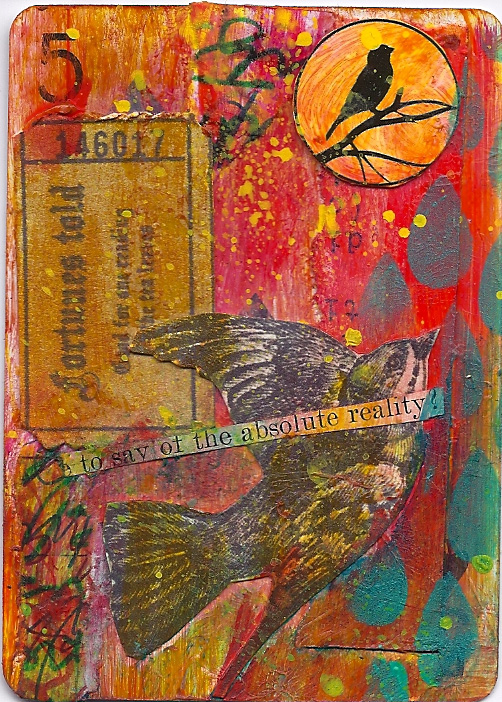
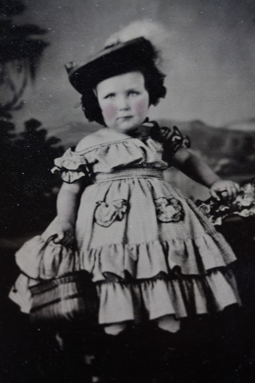
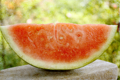
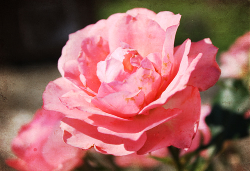
doing lots this week... but not photography! Click here to check out the gorgeous images submitted by thoughtful artists who take their craft seriously -- my photos were taken almost as an afterthought; still, I think you can see I am in a colorful mood!

Kim Klassen's "Scripted Autumn" (overlay @100%), my "medium copper" (lighter color  @70%),

"Scripted Autumn" (soft light @100%), my "medium copper," (inverted, soft light @100%)

"Scripted Autumn" (overlay @100%), my "light copper" (inverted, soft light @50%)
Sometimes I just want to make colors, and that's why I love to dye -- I really enjoy the mad scientist aspect of mixing the dyes and playing with chemicals.  But most of all, I am thrilled by the mystery of how it will all turn out.  I like to do low-immersion dyeing; the patterning of the colors on the fabric (and even the colors themselves) comes out differently every time since I don't follow exact recipes.

(I generally leave the fabrics in the dye anywhere from 4 to 24 hours.  I am not overly fussy about the batching time.)

This time I also dyed yarns, threads, cheesecloth, throwsters waste, and silk carrier rods.  They all took the dye beautifully!


I like to use the spent dye to stain tissue paper or paper towels for use in collage.  The dye that has already been used to dye fibers still has enough umph to color the papers and since I hate to let anything go to waste, I embarked on a major paper staining sub-project.  You can see in this photo how you quickly run through stacks and stacks of tissue paper; for some reason I ended up with miles of green paper.....

One thing leads to another, and since I had all the equipment out, I wanted to try batiking using dyes instead of paint.  (I had previously taken a workshop on soy wax batik with Melanie Testa using fabric paint.)  The soy wax stood up pretty well to all the rinsing you have to do to get rid of excess dye.  The beauty of soy is that it is safe for household plumbing -- a good thing since much of it washed out in warm water.  The photo doesn't do justice to these pieces.... they turned out very well:


As if all this wasn't enough, I've been reading Jane Davies' new book, and thought I'd try out the tyvek technique she mentions in it.  You basically just iron some tyvek between sheets of newspaper (you can use an express mail envelope from the post office).  After a few passes with the iron, it will begin to shrivel and distort.  Being careful not to melt it too much, you can get some interesting weathered effects.  Here, I've taken shriveled tyvek pieces and painted them with metallic paints.


British artists such as Maggie Grey and Jean Littlejohn and Jan Beaney use these in their free-form embroideries, but I think they would also work well in collage. Here, I've used a piece as a decoration for a box I made:
Sometimes I think that I enjoy making the elements of art -- the decorated papers, the painted and decorated surfaces, the dyed fabrics -- even more than the finished artwork.  I love color and texture for its own sake.  What's your favorite part of the process?

Saturday, July 30, 2011

Gridlock

Week 4 of Jane Davies' Dynamic Composition class has been much harder than I expected, given that we were exploring the concept of "the grid."  Grids are old hat to quilters -- so I blithely started pasting away with my painted papers and dyed paper towels, when I realized .....

8.5"x11"

...collages are NOT the same as quilts! 

 I tried using the principles that I follow in quilting:  find a color scheme that you like, gather as many different shades, tones, values of the colors that you can, make sure you include other colors in order to make a smooth gradation from one to the other...  

...but then you end up with a lot of little pieces that look like a bunch of little pieces.  Now this may just be the consequence of my obsessive nature; I am nothing if not detail oriented -- ask my quilting buddies!  I am famous for saving impossibly tiny snippets that everyone else throws away (I do use them!) 

 The difference, I think, is in the scale of the piece.  


a jumble of little bits and pieces
The small pieces I use in quilting are basically like the pixels in a photograph.  If you ever look at a photo, pixel by pixel, you will see what I mean:  a green leaf might actually have many different greens, some purples, and blues -- sometimes even zingers like red, orange, or yellow.  Likewise, when I use tiny scraps of many fabric colors in a quilt measuring, say, 78"x85", the viewer has the impression of only one color.  But collage work is on a much smaller scale than a quilt.  I found that at 8.5"x11", for example, I couldn't use my formula of "lots of little bits," because it just ended up looking jumbled and cluttered.

... and forget about it at 5"x5"!  In these pieces, I realized that the ones that worked better used fewer, and larger, elements.  To my eye, the one on the lower right seems most harmonious:
5"x5" studies


To solve my problem of scale, I cut the 8.5"x11" collage I showed at the top of this post into 2.5"x3.5" ATC's, and immediately noticed a difference.  While not "finished" in any way, they started to look more interesting.


So am I right in thinking that elements of a successful collage -- even those using a grid format -- need to include a difference in scale within the piece?  And, more to the point, how do I achieve this the first time around, without resorting to cutting up my original?

Friday, July 22, 2011

Colors -- micro and macro

Sometimes you just don't have time to catch your breath -- and I don't mean because of the 100 degree plus temperatures outside.  I've been busy all this week with "stuff".... mostly errands and other boring yet necessary tasks, but there has been some fun thrown in the mix, too.  My Dynamic Composition class with Jane Davies is probably one of the best online classes I've ever taken.  I feel as though I am finally internalizing some design principles that I've read about, but never really used. Here are my pieces for our lesson on cruciform shapes:


On Saturday, I went to The City Quilter for an "in-person" workshop with Julie Fei-Fan Balzer (She blogged about it here).  We splashed paint on fabric (a great way to turn the "uglies" in our stash into something useful) and had a wonderful time cutting and pasting our collages into fun mini-quilts.  Thank you, Julie, for a terrific class!  This is my sample from the class -- I stitched the petals down, but haven't decided what (if anything) I will do with this, so the background is not yet quilted:


Probably the most exciting thing for me, though, was trying out my new macro lens. I've been out every morning at 6 to catch the best light... but what I am learning is that this lens really requires a much steadier hand than the standard lens.   Most of my shots were not perfectly focused, or were only partly focused.  On the other hand, I am realizing there is a whole world out there that I've never even seen!

Uh, oh.... I need a new obsession like I need a hole in the head.


And if this isn't enough, I tried using the new lens in lieu of a scanner to copy some photos in an antique album that once belonged to my husband's great-great grandmother.   I couldn't resist this cutie pie:

"Little Ida May"

Thursday, July 14, 2011

Letting go and trusting that there will always be enough

I am really enjoying my class with Jane Davies!  I love playing with paints and papers in my kitchen, and it is wonderful to have a mentor on the other side of my computer screen giving me constructive feedback -- it doesn't get any better than this!  Here are my final collages from our second lesson on landscapes:

collage #1 before......                                 collage #1, final version 

collage #2, first stage                                      collage #2, final version

collage #3, first stage                               collage #3, final version

 collage #4, first stage                               collage #4, final version
  

One of the comments I received was about the courage it takes to completely cover over existing work in order to take a piece where it needs to go.  I guess I had never thought about it in those terms before.  Certainly, being willing to work interactively with your creation is very important.  That, and not having a preconceived notion of what the outcome should be, really help you make better decisions on the fly.  For me, the most important part of the process is letting go and trusting that I will hear the voice of my work telling me what it needs, and that I will find the right way to let it be whatever it needs to be.

It is also very much about letting go of any sense that my work -- and the materials I work with --  are "precious."  I try (and this is a constant struggle) to detach from any sense of value.  When I remember that there is always more where "this" came from, I don't hesitate to follow my gut instincts and I lose the fear that I won't be able to replicate or replace whatever it is I'm working on.  Quilters and collage artists are probably most susceptible to this fear -- don't we all have those gorgeous hand-dyed fabrics or specialty papers that we never use because they are just too beautiful?  (We say to ourselves that anything we could do with them could not possibly do justice to their intrinsic value...)

I try to hold onto the thought that if I trust that there will always be enough materials, ideas, and creativity available, then I will find them when I need them.  If instead I hold on and hold back, I am cutting myself off from the flow, which is the source of everything.

I think there's a life lesson in there, too.

Tuesday, July 12, 2011

Pink!

I am so not a pink girl; I much prefer saturated, vibrant colors.  Much to my dismay, this week's theme over at Kim Klassen's Texture Tuesday party is "pink."  Now don't get me wrong.  I love her soft, dreamy, vintage style images, but somehow things like that never seem to come out of my camera.  So the best I could do is a watermelon.... I mean, sure, it's pink...sort of.  Well, it's as close as I get.  Click here to visit Kim's Cafe and see the work of some truly amazing artists.
watermelon
processed with Kim Klassen's "Silence" (soft light @100%), "Golden" (soft light @100%), "Canvasback Magic" (soft light @79%), and "Golden" (color burn @100%)
I did find a pink rose (with some interesting brown spots), which I'm adding almost as an afterthought (flowers are too easy):
pinkrose
processed with Kim's "Canvasback Magic" (soft light @50%), "Warm Sun" (overlay @58%), and "Greyday Slate" (overlay @52%)

I don't know if photographers have this problem, but as a quilter and mixed media artist, I have "issues" with certain colors.  They just don't naturally appeal to me, so I don't feel comfortable using them.  The good thing about the pink challenge is that it moves me outside my comfort zone.

This week in my online class with Jane Davies, we have been working on simple collaged landscapes.  Here are some of my preliminary color studies:

I even used some pink!