You know, sometimes you just look at a texture and you know immediately that it's going to work for you. Kim Klassen's texture for this week is called "Cracker Jack," and I am in love. It's just the right thing to use to give your image a vintage feel.
My garden is looking dreary and bedraggled from the big storm last week, so I dipped into the archives to play with my new favorite texture. Click
here to visit Kim over at the Cafe, and check out all the wonderful eye candy there.
First I tried it on some daisies:
 |
| Kim Klassen's "Cracker Jack" (color burn @100%), "Mayzee" (soft light @51%) plus one layer of a texture of my own (made from macro photos of the copper pans I showed for the Orange e-dition of TT!) |
 |
| "Cracker Jack" (overlay @70%) and "Cracker Jack" (color burn @75%) plus one inverted layer of my copper texture |
 |
| I didn't record my texture recipe... sorry! I think I used Kim's "Aurora" and not "Cracker Jack," in any case.... |
It added a nice rough texture to this grasshopper -- doesn't he look like an alien?
 |
| I added a gradient map adjustment layer (blue-purple-green), then "Cracker Jack" (linear burn @100%), and another layer of "Cracker Jack" (inverted, then put on screen mode @51%) |
I used it on some Italian architecture, and here's where I started to really see some possibilities:
 |
| "Cracker Jack" (soft light @25%), "Cracker Jack" (overlay @39%), "Warm Grunge" (soft light @75%), "Warm Grunge" (screen @20%), and one layer of my copper texture |
 |
| "Cracker Jack" (overlay @57%), "Mayzee" (multiply @22%), "Warm Grunge" (overlay @49%), and one layer of my copper texture |
 |
| "Cracker Jack" (soft light @10%), "Warm Grunge" (overlay @100%), "Mayzee" (color burn @25%), and one layer of my copper texture |
 |
| "Cracker Jack" (overlay @48%), "Warm Grunge" (color burn @61%), "Mayzee" (overlay @40%), and one layer of my copper texture |
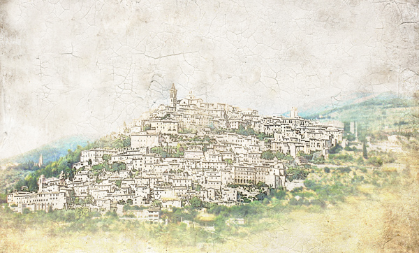
But this last one is my favorite of all -- it made this hill town look like an old map:
 |
| First, I cut the town from the background and applied the poster edges filter. Next I added "Cracker Jack" (overlay @100%) and "Mayzee" (normal blending mode @66%, texture brushed off the buildings.) |
When I wrote the title for this post, I was thinking of the old Cracker Jack commercial -- the one with the little kids at the fair.... (I would sing the jingle for you, but you might never come back! Check it out on
YouTube instead.) I don't really have a prize, but I thought I would share my copper textures if you are interested. I merged several images of copper pans on three different blending modes, and really like the results. They give a nice warmth to an image, and if you invert them, you get a lovely blue color mask. If you do use them, please link back and show me what you've done with them!! Click
here to access my mediafire box.
 |
| "light copper" |
 |
| "medium copper" |
 |
| "verdigris" |


18 comments:
Love those images, especially the second one.
Love all your photos! I may have to give your textures a try! Very neat!
Wow, your shots of Italy are amazing. They really go together nicely with the textures. What town were you in?
Thanks for the nice comments! @Anita, the shots of buildings were all taken in Assisi, and the hill town was somewhere in Umbria -- believe it or not, I took that shot from the autostrada in a moving car with the windows rolled up!
What a great display of images with this texture! You have managed to give each image its individuality. At first glance I was trying to decide which I liked best but decided they are all so unique. They are beautiful. Great job!
oh your editing is so gorgeous!
I'm impressed that you experimented with so many photos. Each one is wonderfully done - good job!
Wow, what a wonderful texture work. Great !
Your own textures are really creativ.
absolutely love the Italian architecture photos and the town on the hill amazing
What an inspiration! I hope to play with your copper this weekend as I LOVE the outcome. Great subject matter- from the flowers to the architecture. The map is my fav with the blues in the second flower. Thanks for the textures.
Amazing, I really like the Italian architecture photos, they turned out really nice and I LOVE the last one too, "city on a hill". Wow.
Wow! Lots of amazing creativity here and to make your own beautiful texture--awesome! I love the feel the textures gave to Italy and that last "map" one so cool and beautiful!
Love all the uses of crackerjack here. Thanks for your kind comment at my place!
All of your images are beautiful but I especially love the last one - the hill town - great processing!
so many great edited photos - you made the perfect tour for photographing! love the second one the most (blue is my favorite color), but the others look awesome, too! thanks so much for your freebies, will let you know when i used them.
I love all your Cracker Jack textured images ~ they're wonderful !! You own copper textures are fabulous too!!
These are fabulous images, Kathleen! I love your city on the hill. It is a beautiful composition. Thanks so much for the freebie textures. I love the look of copper patina. Hugs, Terri
Kathleen,
Really excited about your textures! I layered both copper textures on the series of flowers except the more green one which uses the verdigris. Thanks so much! Now I just need to learn how to invert :)
Post a Comment