
 |
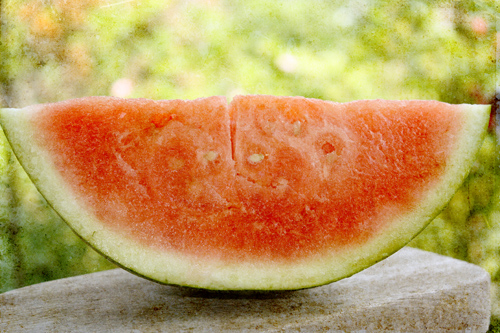
| processed with Kim Klassen's "Silence" (soft light @100%), "Golden" (soft light @100%), "Canvasback Magic" (soft light @79%), and "Golden" (color burn @100%) |
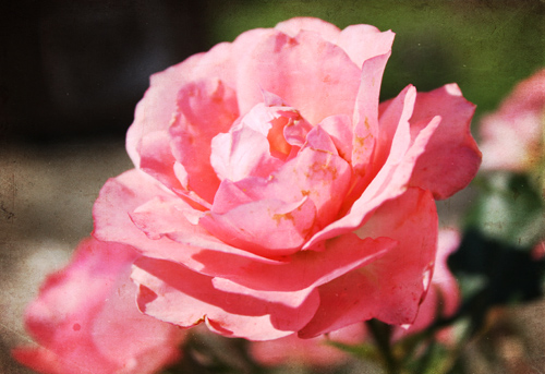 |
| processed with Kim's "Canvasback Magic" (soft light @50%), "Warm Sun" (overlay @58%), and "Greyday Slate" (overlay @52%) |
I don't know if photographers have this problem, but as a quilter and mixed media artist, I have "issues" with certain colors. They just don't naturally appeal to me, so I don't feel comfortable using them. The good thing about the pink challenge is that it moves me outside my comfort zone.
This week in my online class with Jane Davies, we have been working on simple collaged landscapes. Here are some of my preliminary color studies:


13 comments:
I definitely have issues with certain colors. Probably my most disliked color is burgundy. I love your watermelon photo. Definitely fits into the range of pink in my book!
These are just beautiful.
Hope your day is blessed!
Wonderful job!!
Love the PINK watermelon! Pink was a tough challenge...Love these!
Love the pink!!!! Just great.... :)
I always like the more vibrant stuff myself--until I see some one else's soft and dreamy work like Kim's :)
The watermelon is very lovely with the texture!
The watermelon is a great subject for "pink". I like your collage study and you even got that pink in there.
perfect! love your watermelon! i agree, i have a hard time with some colours. it makes me itchy to work with browns & oranges...unless i mix them with turquoise or limes....
Love your photo images - the rose has such an amazing range of colours in it - even orange! Your collage landscapes are sooo inspiring!
Your watermelon is just the best, and I adore you color collages. Am so interested in your online classes. I notice that they are presently in session so will keep my eye out for when you engine again. So nice to find your site. Genie
Beautiful photos, and your collages are really wonderful. You have a great way with color, (including pink!!)
I'm playing catchup - so many blogs to see. I'm glad I didn't miss yours! The watermelon is making my mouth water!
Beautiful pictures!
I noticed your taking an on-line course with Jane Davis. I love her! I'll have to check it out.
Thanks for sharing your pictures.
Post a Comment